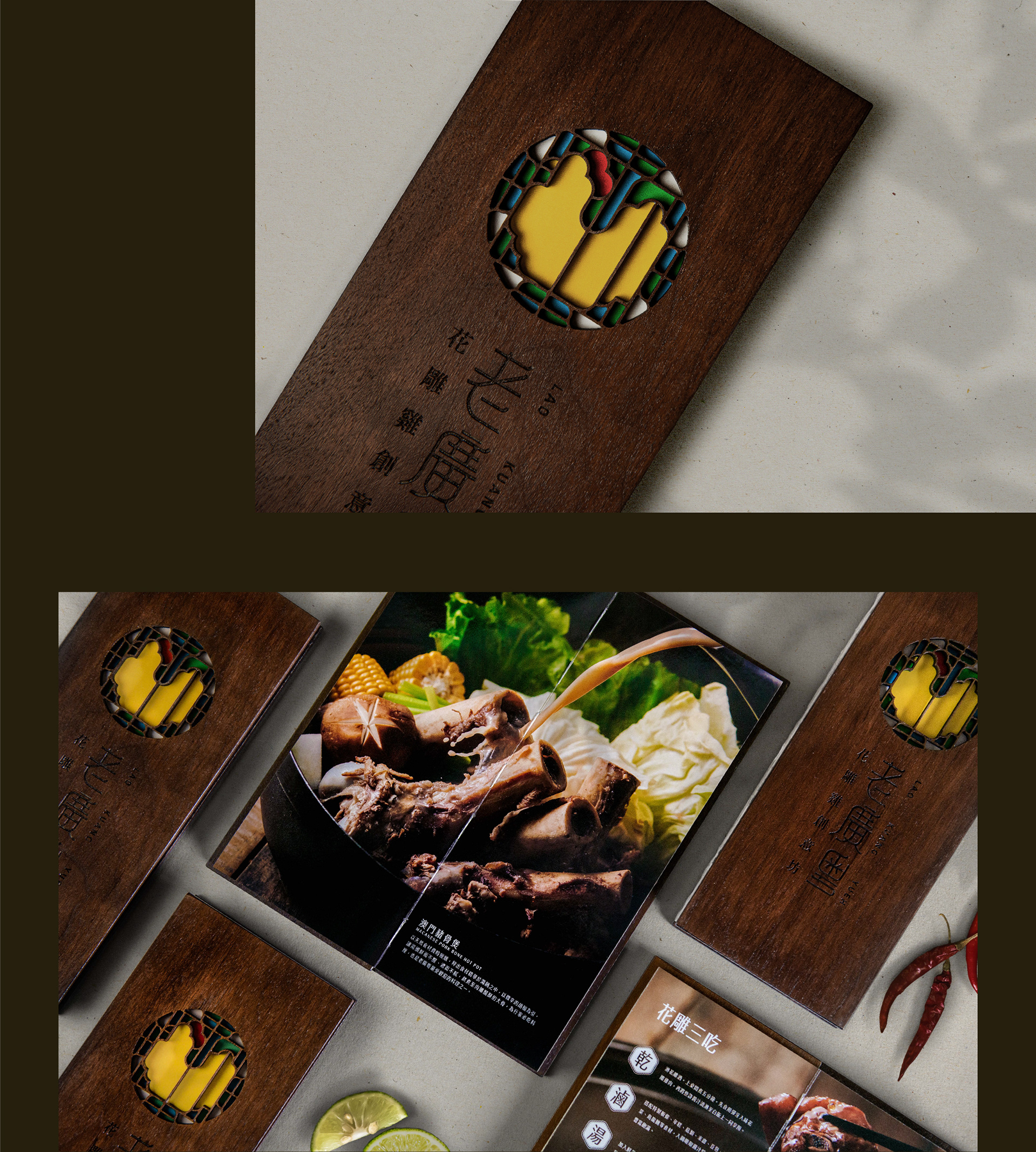
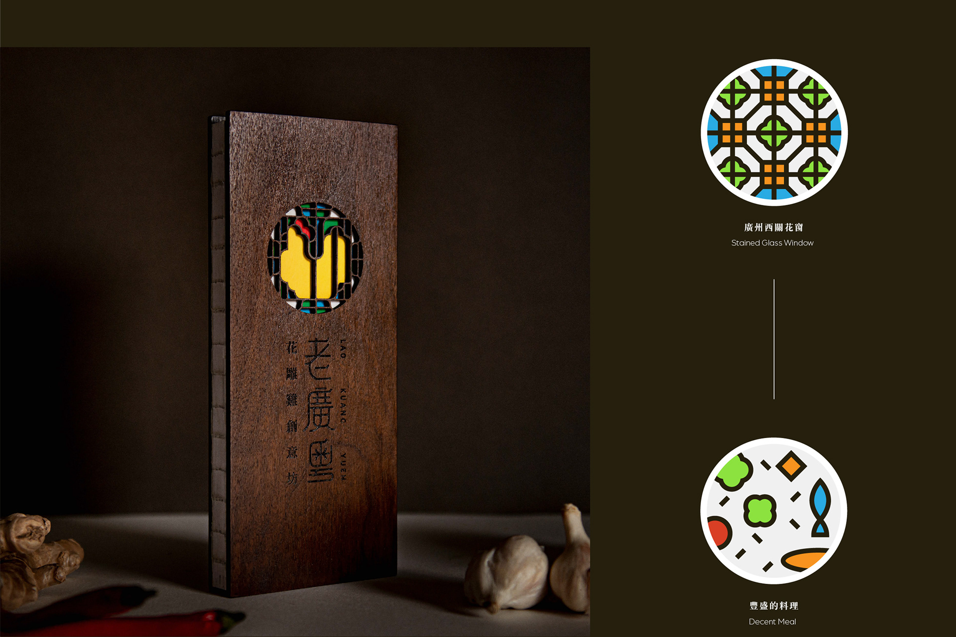
此專案為臺南在地數十年餐廳品牌的識別轉型,將過往不易識別的書法字體改以圖像標誌來呈現,概念採用廣州西關著名的彩色玻璃花窗作為品牌象徵,結合招牌菜色-廣粵花雕雞料理,展現此店忠於原味且用料道地。
標準字採用簡練的線條,借鑒了許多花雕木窗的彎折處與紋飾結構,呼應老闆娘設計的許多臺廣結合的創意好菜,新舊融合的風格。
Brand image transformation of a famous restaurant in Tainan, with decades of history.
Instead of illegible old Chinese calligraphy trademark, the concept is based on beautiful stained glass window in Xiguan, Guangzhou. As well as their signature dish “Cantonese Hua Diao Chicken Dish”, which is original and authentic. it’s a Taiwanese and Cantonese fusion restaurant, a combination of traditional and modern styles. Ideas of curves and patterns from traditional wood carving windows are added to its refined font.
Instead of illegible old Chinese calligraphy trademark, the concept is based on beautiful stained glass window in Xiguan, Guangzhou. As well as their signature dish “Cantonese Hua Diao Chicken Dish”, which is original and authentic. it’s a Taiwanese and Cantonese fusion restaurant, a combination of traditional and modern styles. Ideas of curves and patterns from traditional wood carving windows are added to its refined font.